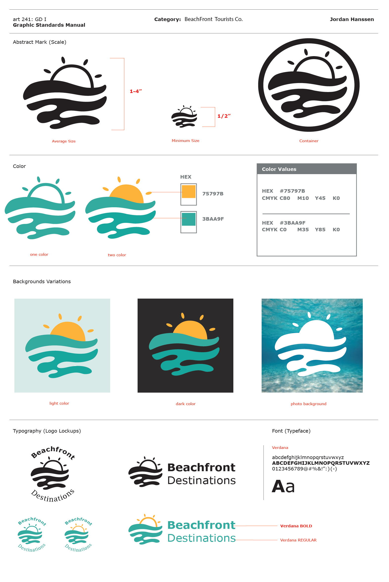
Brief :
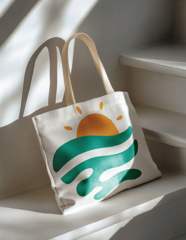
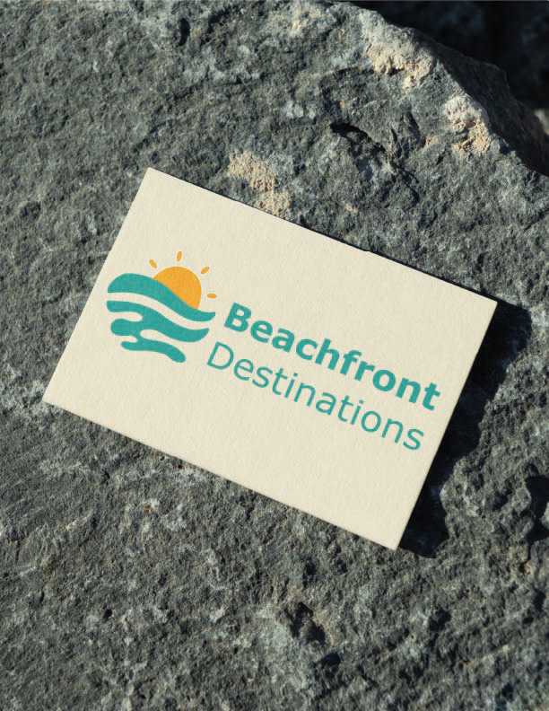
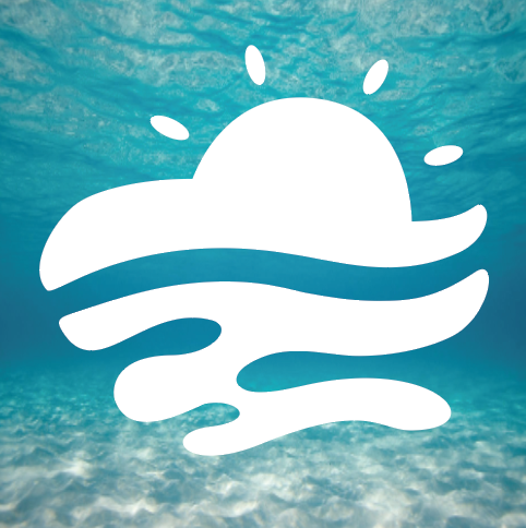
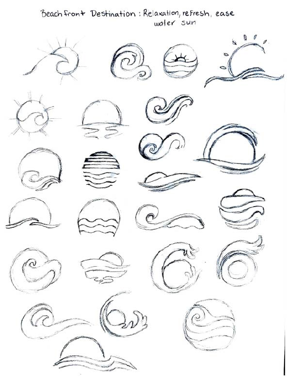
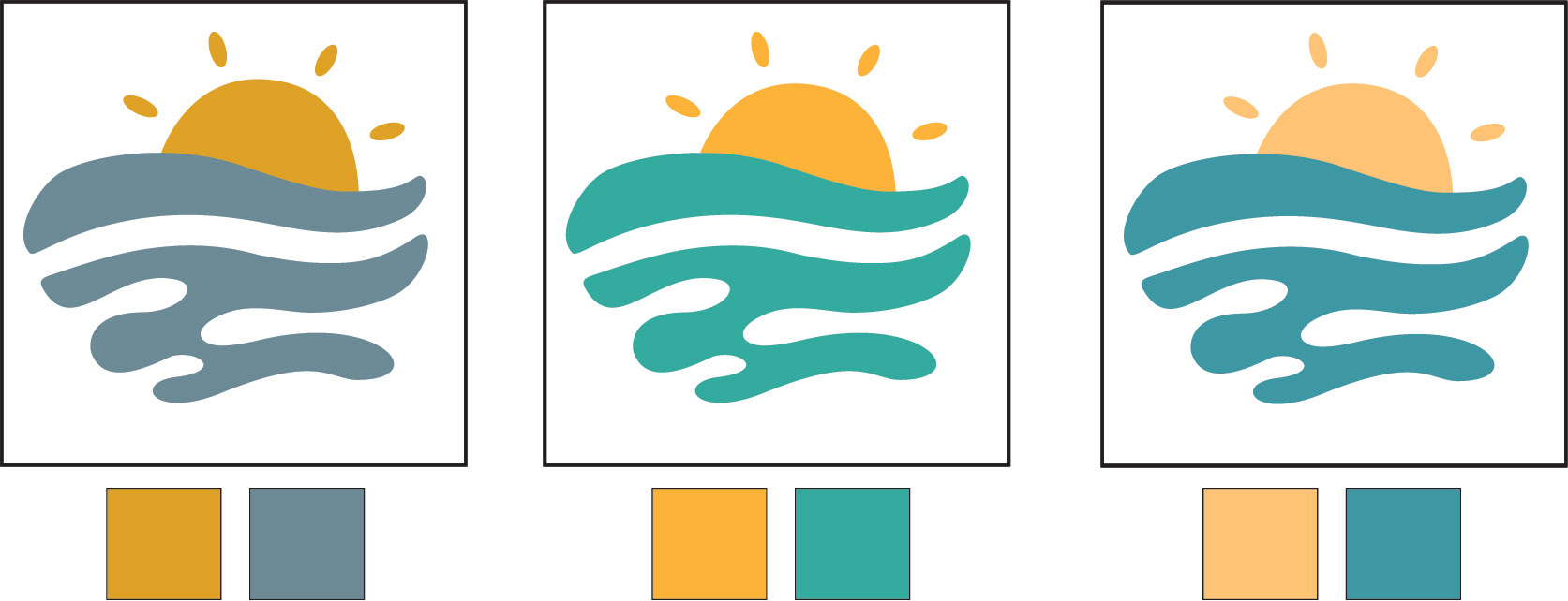
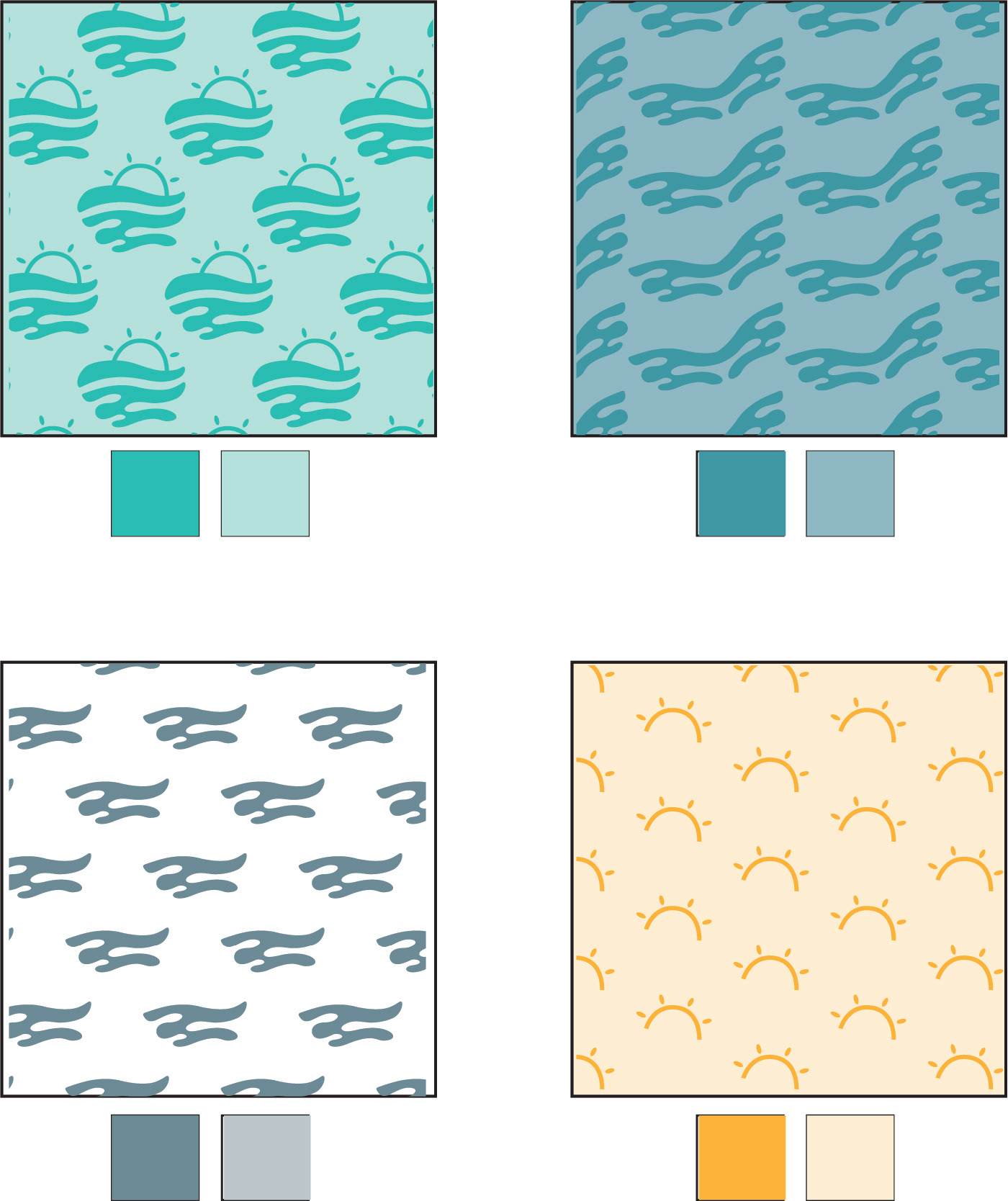
Our task for this project was to create an abstract logo inspired from a specific word. My word that I decided on was relaxation. My concept was for a beachfront tourist company. After taking some time to research things centered around my word, I began to sketch out ideas for possible logos. I knew I wanted to incorporate water and the sun while keeping a simple yet direct look. During my studies I messed around with flowy lines mimicking waves and adding movement. Eventually I landed one that I felt was successful. From there I progressed into selecting colors from photos that matched the vibe I was going for. I was looking for colors that were playful and inviting to a family audience. Next came the font selection, I was searching for simple yet bold to make it legible. With all things considered for the colors and font, I went with teal and yellow for the logo colors and the font Verdana. I believe that these choices completed my abstract logo by making it bright and eye-catching while staying easy to read in various explorations. Finally, when I was satisfied with my final logo, I then practiced patterns while deconstructing elements of the logo and worked on possible packaging to expand my brand.
Hand Sketches
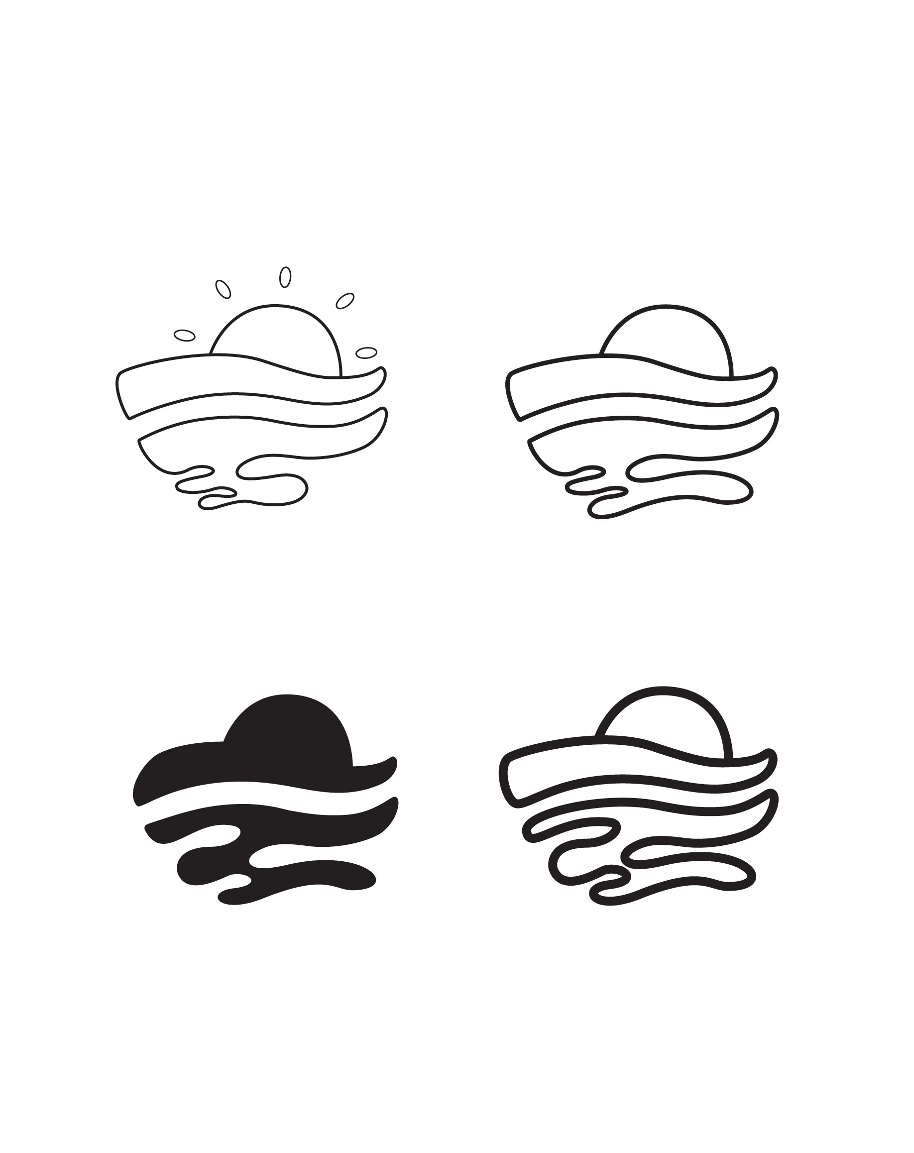
Early Digital Sketches
Color Explorations
Pattern Explorations
Final Logo Studies
Logo Mockups